Data in the Upworthy Research Archive
The Upworthy Research Archive is a dataset of headline A/B tests conducted by Upworthy from early 2013 into April 2015. This page documents the archive and answers common questions. We have also published an academic paper that reports the details of the archive and our work to validate the data. Please cite this paper when using the archive.
- Matias, J., Munger, K., Le Quere, M.A., Ebersole, C. (2021) The Upworthy Research Archive, a time series of 32,487 experiments in U.S. media. Nature Scientific Data.
You can download the archive on the Open Science Framework at osf.io/jd64p/.
Background
For background on the Upworthy Archive, please consult and cite the following sources:
- Matias, J.N., Munger, K. (2019) The Upworthy Research Archive: A Time Series of 32,488 Experiments in U.S. Advocacy. CODE@ MIT Conference.
- Medium post: Announcing the Upworthy Research Archive
- Matias, J.N. Aubin Le Quere, M. (2020) Asking Questions of the Upworthy Research Archive, a slide deck from Matias’s field experiments class. This deck includes advice on meta-analyzing the archive.
Potentially Invalid Randomization June 2013 - Jan 2014
In June 2024, the team published an update with evidence of systematic randomization problems in 22% of A/B tests. Working with the authors of six peer reviewed studies based on our work, we found that no prior findings were materially affected. We discourage confirmatory researchers from using experiments conducted between June 25, 2013 and January 10 2014.
The following post includes more information and guidance for authors going forward. We have also updated the Data Descriptor at Scientific Data to reflect this update, and have added the randomization_imbalace_risk column (documented below) to the data to indicate A/B tests that we believe are likely affected.
Units of Observation
The Upworthy Research Archive contains packages within tests. On Upworthy, packages are bundles of headlines and images that were randomly assigned to people on the website as part of a test. Tests can include many packages.
The archive only includes aggregate results on the number of viewers a package received and how many of those viewers clicked on that package. It does not include any individual-level information to differentiate between viewers.
Inclusion/Exclusion Criteria
This research archive includes valid tests conducted by Upworthy in the study period. We have omitted tests that were never shown to viewers (zero impressions) and packages that had missing test IDs.
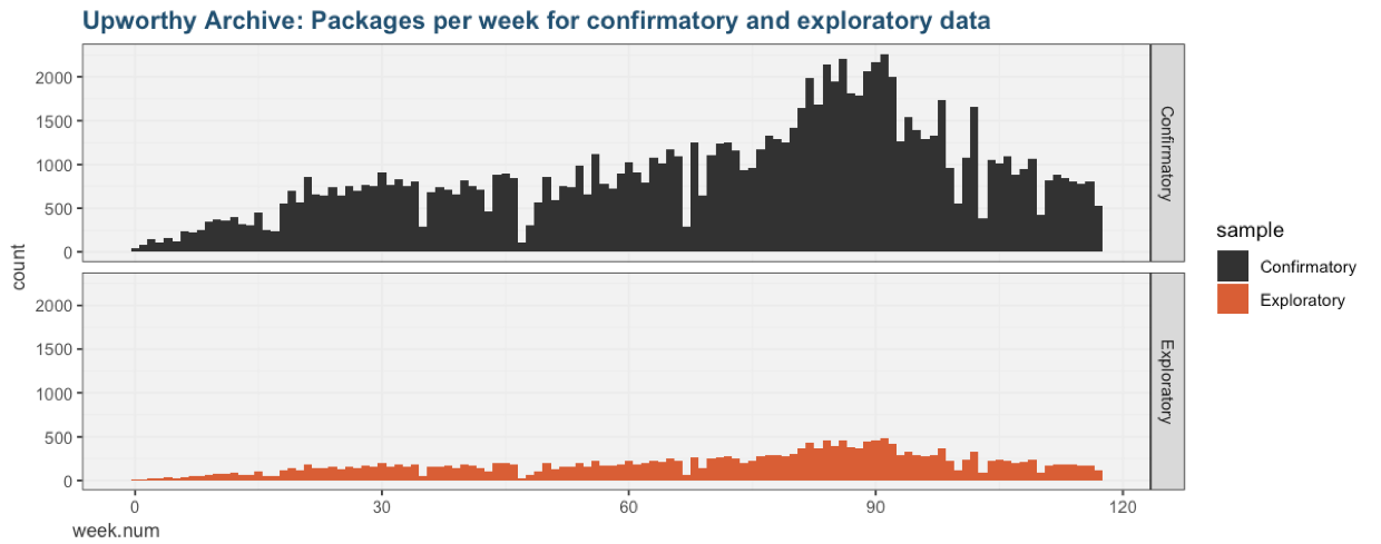
Exploratory and Confirmatory Datasets
To support reliable scholarly research and education, we are releasing the Upworthy Research Archive as a partial exploratory dataset. We will share a confirmatory dataset with researchers whose analysis plans have been peer reviewed (read more about the process).
The exploratory dataset includes 22,666 packages from 4,873 tests. The confirmatory dataset includes 105,551 additional packages from 22,743 tests.
To support time-series research, both datasets are a random sample stratified by week number.
Selecting Headlines for Comparison
We expect that many researchers will want to data-mine the archive for specific headline types and compare them to other headlines within the same tests. We created this task as a workshop and homework assignment for students in a Cornell class on the design and governance of experiments. Students were asked to meta-analyze the effect of including a notable person’s name in a headline, and the effect of including a number in a headline. We offer the materials below as food for thought when developing your own data-mining approach:
- Slides: Asking Questions of the Upworthy Research Archive
- Example code in Python and R: Sampling and Analyzing the Upworthy Archive Exploratory Dataset
Columns in the Upworthy Research Archive
The dataset of packages contains the following columns:
Time-related columns:
- created_at: time the package was created (timezone unknown)
- test_week: week the package was created, a variable constructed by the archive creators for stratified random sampling
Experiment-related columns:
- clickability_test_id: the test ID. Viewers were randomly assigned to packages with the same test ID
- problem (0/1): set to 1 if the researchers believe the randomization for a given test was likely to have a randomization problem (see this page for more details). This value is set to 1 for all tests between June 25, 2013 and January 10, 2014.
- impressions: the number of viewers who were assigned to this package. The total number of participants for a given test is the sum of
impressionsfor all packages that share the sameclickability_test_id.
Stimuli shown to viewers:
- headline: the headline being tested
- eyecatcher_id: image ID. Image files are not available. Packages that shared the same image have the same eyecatcher_id
Outcomes:
- clicks: the number of viewers (impressions) that clicked on the package. The click-rate for a given package is the number of
clicksdivided by the number ofimpressions.
Miscellaneous columns that may be of interest. To our knowledge, none of these columns represent information shown to viewers as part of A/B tests:
- excerpt: article excerpt
- lede: the opening sentence or paragraph of the story
- slug: internal name for the web address
- share_text: summary for display on social media when the article is shared. This was not shown in tests, since tests were conducted on the Upworthy website
Columns we learned about through conversations with former staff:
- square: when used, part of the same social media sharing suggestion as the share text
- significance: NOT an estimate of statistical significance; former employees were unable to recover the method used to generate thist figure
- first_place: Along with significance, shown to editors to guide decisions about what test to choose
- winner: Whether a package was selected by editors to be used on the Upworthy site after the test
- updated_at: The last time the package was updated in the Upworthy system
Talk To Us Before You Scrape & Merge Data from the Web
We have also been scraping Upworthy and the Internet Archive in search of supplementary information, including images. Since only some tests and packages can be supplemented in this way, we are doubtful that this data will be useful for confirmatory research. Please contact us if you think that these columns might be important to your research.